DO NOT choose an arbitrary color.
UT Southwestern Logos
The UT Southwestern Medical Center logo is more than a trademark. It symbolizes all that we represent. It’s our organization’s signature. So it is critical to reproduce it faithfully and precisely wherever it appears.
The purpose of these logo standards is to make sure that our logo – our signature – is as authentic as our name.
Institutional Logo
The UT Southwestern institutional logo may be reproduced using one of four versions.
Always reproduce the logo using the original digital art. Never redraw, reset, distort, or alter it in any way.
This is the preferred version: “UT Southwestern” is PMS 2945 blue, and “Medical Center” is PMS 431. Whenever possible use this version.
This is a positive one-color version that may be used if only one color is available. The logo may be either PMS 2945 blue or solid black.
This is a positive one-color version that may be used if only one color is available. The logo may be either PMS 2945 blue or solid black.
Brand Extension Logos
While the UT Southwestern Medical Center logo is the institutional brand, we have several brand extensions. For example, our hospital, physician groups, service lines, and schools also carry the UT Southwestern brand and have a variation of the institutional UT Southwestern Medical Center logo.
Each of the brand extension logos assumes the same level of integrity and are equally symbolic of excellence. However, only O’Donnell Brain Institute, Simmons Comprehensive Cancer Center, Pediatric Group, and Medical Schools can be used in the same capacity as the institutional logo. Department, Division, Office, or Program logos can only be used internally, on employee apparel, branded giveaways, or as determined by the UTSW marketing team.
The logo standards developed for our institutional brand apply to our extension brand marks as well. The guidelines for color, fonts, and area of isolation are to be followed for all logos everywhere they appear.
Always reproduce brand extension logos using the original digital art. Never redraw, reset, distort, or alter them in any way. If you are in need of a brand extension logo, email the Brand Team at brandidentity@utsouthwestern.edu.
Examples:
Like the institutional logo, the examples utilize the words “UT Southwestern” in bold, over the name of the group in unbolded font, flush right.
University Seal
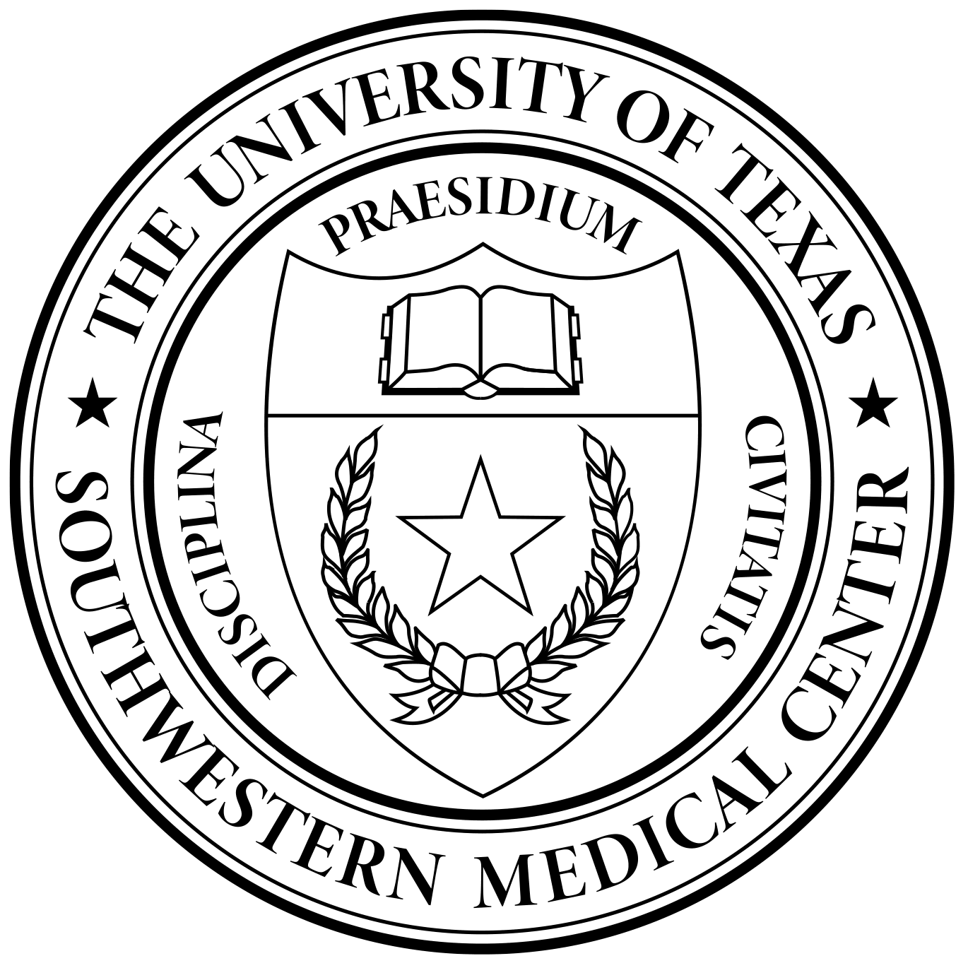
The UT Southwestern seal is a registered trademark of the Board of Regents of the UT System, and any proposed use of it for commercial purposes must be submitted to the Executive Vice President for Institutional Advancement, who will provide a recommendation for the President’s decision.
The UT Southwestern seal may only be used in the following cases:
- On official or formal documents, such as diplomas and certificates approved by the President
- As a watermark on official stationery, but it should not be printed on stationery, note cards, or invitations
- On certain official publications of UT Southwestern, on brochures announcing UT Southwestern-approved continuing education programs, and on poster exhibits for scientific conferences
As with UT Southwestern logos, always reproduce the official seal using the original digital art. Never redraw, reset, distort, or alter it in any way.
Logo Usage
Our logo must be seen to be effective. So always leave a buffer zone around the logo that is clear of all other graphic elements. This separates the logo from its surroundings and allows it to stand out.
Use the height of the capital “T” to measure the minimum amount of clear space to leave around the logo.
Minimum Size
If our logo is too small, it will be hard to read and be ineffective. Therefore, there is a minimum size for reproducing the logo in each medium. Never use the logo any smaller than the minimum size.
- In print, the minimum size is 1.25” wide.
- In on-screen uses, the minimum size is 187x30 pixels wide.
- In on-screen uses for retina display only, the minimum size is 108 pixels wide (vertical version), and 216 pixels wide (horizontal version). Retina display screens have a higher pixel density, so 108 pixels in retina display is the same size as 54 pixels dpi.
For scrubs, lab coats, uniforms, and other giveaways, the minimum size is determined by the physical dimensions of the available space.
Logo Color Palette
UT Southwestern Blue is the unique color associated with our organization. People recognize us by our colors, so it’s very important to reproduce them accurately in every application.
Our colors are identified using PANTONE® Matching System (PMS) colors. Always specify the exact PMS color or match it using one of the formulas provided for other media.
In Print
Spot color:
- UT Southwestern Blue is PMS 2945 on coated stock or PMS 300 on uncoated stock.
- UT Southwestern Gray is PMS 431 on coated and uncoated stock.
Four-color process:
(C) Cyan, (M) Magenta, (Y) Yellow, (B) Black
- UT Southwestern Blue is C100, M60, Y0, K20.
- UT Southwestern Gray is C0, M0, Y0, K75.
In Digital Media
UT Southwestern Blue is R0, G76, B151.
UT Southwestern Gray is R99, G100, B102.
Logo Typography
Our logo typography includes two fonts, or typefaces:
- Helvetica Neue Heavy is the font used for “UT Southwestern”.
- Helvetica Neue Roman is the font used for “Medical Center”.
The UT Southwestern logo is a proprietary design. Although based on these two fonts, it is a custom-made design and cannot be re-created using typography. Never use fonts to attempt to re-create the logo.
Always reproduce the logo using original digital art. And never alter or distort the logo in any way.
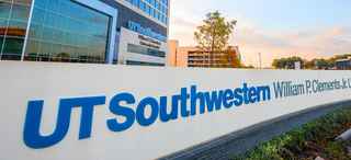
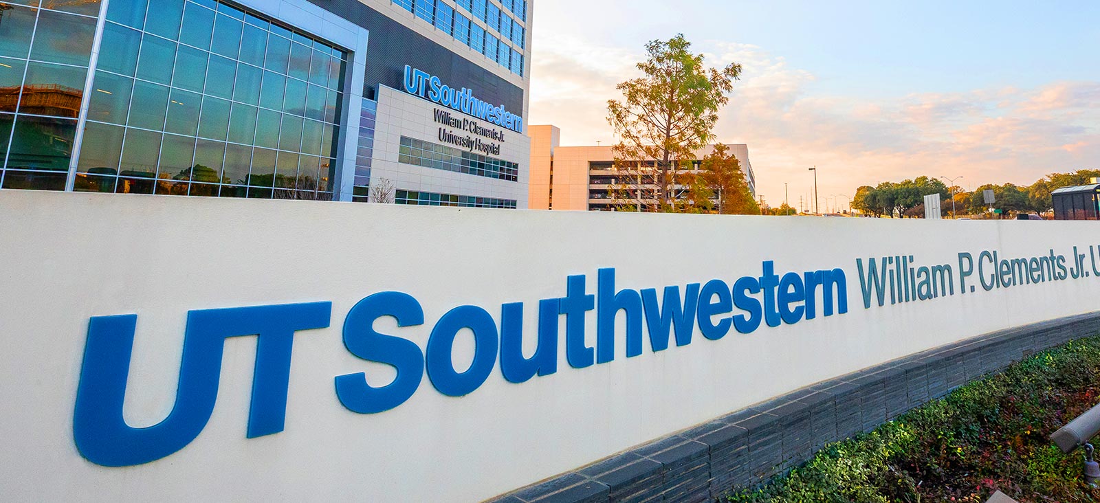
Signage Standards
UT Southwestern signage on, around and within our buildings is often the first thing seen by our patients and visitors. Thus, signage should always support our brand and the image it represents, and follow the guidelines located within the UTSW FM Document Library. All signage requests and approvals should be directed via email through the UTSW Sign Shop (email).
Logo Do Nots
In order to maintain brand consistency and professionalism, please pay close attention to the “Do Nots” listed below.
Thank you for your cooperation.
DO NOT rearrange the color hierarchy.
DO NOT stretch, alter, or manipulate the logotype in any way.
DO NOT left justify or center justify the descriptor.
DO NOT use low-resolution (blurry) logotype.
DO NOT change the leading (space) between the logotype and descriptor.
DO NOT place the logo over an image, which compromises contrast and readability.
DO NOT use the logo on a diagonal slant or sideways.
DO NOT crop the logo.